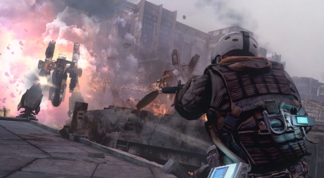
Here's some fresh screenshots from the Killzone 3's Retro Map Pack DLC.
The two maps (Salamun Market and Blood Gracht), take players back to 2359, when the invasion of Helghan had just got. Both maps are reworked classics from Killzone 2. Check out the sreens below.
Loakum Ugh….scratch that previous comment. The upcoming Game of Thrones video game is a F’in mobile phone game. Why can’t they came an open world GoT game, like Witcher 3 or God of War? (> 3 Months ago)
Loakum By FAR, the upcoming Game of Thrones King’s Road was the Game of the Show! It plays like God of War Ragnarok! :) (> 3 Months ago)
Loakum @Driftwood Awesome! I’m loving it! It does show a much crisper picture and the frame rate looks good! I was playing Stella Blade and Dragonball Soarkling Blast! :) (> 3 Months ago)
Driftwood @Loakum: enjoy, the one Sony sent us will be there on launch day. Coverage will follow asap. (> 3 Months ago)
Loakum *takes a large sip of victorious grape juice* ok….my PS5 pro arrived early! So much winning! :) (> 3 Months ago)
Driftwood @reneyvane: non ils l'ont publié le 1er octobre et je crois que tu l'avais déjà linkée. ;) (> 3 Months ago)
Driftwood Download is now functional again on Gamersyde. Sorry for the past 53 days or so when it wasn't. (> 3 Months ago)
Driftwood Another (French) livestream today at 2:30 CEST but you're welcome to drop by and speak English. I will gladly answer in English when I get a chance to catch a breath. :) (> 3 Months ago)
Driftwood GSY is getting some nice content at 3 pm CEST with our July podcast and some videos of the Deus Ex Mankind Divided preview build. :) (> 3 Months ago)
Driftwood For once we'll be live at 4:30 pm CEST. Blim should not even be tired! (> 3 Months ago)
Driftwood More Quantum Break coverage coming in a few hours, 9:00 a.m CEST. (> 3 Months ago)
Driftwood We'll have a full review up for Firewatch at 7 pm CET. Videos will only be tomorrow though. (> 3 Months ago)
Driftwood Tonight's livestream will be at 9:15 GMT+1, not GMT+2 as first stated. (> 3 Months ago)


All comments (18)
Commented on 2011-02-04 01:13:18KZ3 looks awesome.
Commented on 2011-02-04 01:37:46
Commented on 2011-02-04 01:41:16Waaaaay to early to call it for definite (especially considering UC3 and TLG coming out this year) but certainly a potential GOTY. No potential multiplat looks like it could top this game at all.
Commented on 2011-02-04 01:44:27... have to admit, they made changes between the closed and open beta
those screams from downing the soldiers/yourself are funny at first but borderline annoying after a while
Commented on 2011-02-04 03:03:58
Commented on 2011-02-04 07:52:34
Commented on 2011-02-04 08:11:37These new maps are great, but Salamun Market was definitely my favorite, good thing its in daylight now. You can see more details, even the ISA ships in the sky.
Killzone 3 has a awesome snowstorm level in MP that I saw in review videos, amazing atmosphere (no not the one in the demo).
Thank god they fixed the main issues from Killzone 2 such as...
Controls, you move like a tank and the delay was annoying, thank god thats fixed.
Bulletsponge enemies. You could empty an entire clip and the chances would be they wouldnt die, unless they had low healthbar or its a headshot, good thing its medium fast kills now.
I was hesitating on a purchase a few weeks ago because of the classes and weapons from the closed beta, but I love the changes they have made, so its day 1!
Commented on 2011-02-04 11:11:14
Commented on 2011-02-04 13:03:25 In reply to aphex187the game looks amazing tho, just not quite that smooth AA wise
Commented on 2011-02-04 13:22:48Can't deside which is the better looking from playing the KZ3 beta, and the crysis 2 demo. Character models in KZ3 are definatly better though
Commented on 2011-02-04 15:12:43 In reply to KORNdogthe game looks amazing tho, just not quite that smooth AA wise
Commented on 2011-02-05 03:16:36I finished top in the 5 games i played :D the only problem? i play on my bros PS3 and he didnt like the game so the odds are he will not buy it and seeing as i dont play often enough (i am at uni most of the year) to buy it myself.. i will not be able to play the full game :(
Commented on 2011-02-06 22:03:57 In reply to bleachedsmiles
Commented on 2011-02-06 22:59:01
Commented on 2011-02-07 05:47:14 In reply to shazui
Commented on 2011-02-07 09:46:07 In reply to Frozpot
Commented on 2011-02-07 18:47:59I'm certainly not saying it looks better than KZ on a whole, but to imply KZ2 has a bunch of high-rez, uber-detailed textures is pure denial. Please refrain from posting a picture of the really cool ground texture from the first level. Geometry isn't that great either. Killzone's lighting is Movie-style, which is more dynamic and punchy and Crysis has always gone for a less staged, more-natural look. Killzone hides a lot of it's visual flaws(quite well) behind a limited color palette, constant blur/lens effects, and wind/ particles. Again, it all comes together with a fantastic look, but you are over-hating on Crysis 2 in order to boost Killzone. Let the game stand on it's own. No-one is arguing that Killzone looks better, and KZ3 looks to really improve everything over 2( which is why I have it pre-ordered)...