I'm pretty friggin hyped for this game now. I saw some videos just today and it looks like the game is running extremely smoothly, and a lot of the glitches I was seeing before seem to be gone. I really like the concept of the game. This game is in my top 5.
Commented on 2008-09-11 23:25:31 In reply to KORNdog
Posted by KORNdog
technically the games great, high res textures and all that, but style wise its a right mess imo.
A Rare trademark if you ask me. While i won't whine about the technical aspects, this game is anything but easy on the eyes. But that's just my opinion.
I think its great having a bunch of random oddball variety if you wanted we could have it grey for you two, hell even try and make it realistic so we get less variety in our enviroments, not a big mish mash, it's creativity and style.
The open environment thing looks awesome to me. Makes a change to actually see the whole of the area you're in, yet not have it empty and dull. It's kinda exciting to see all the platforms and whatnot off in the distance ready to be explored.
Commented on 2008-09-11 23:56:13 In reply to Schmooboo
whats wrong with you
fables imo will be the best game of the year this game is a definit buy but youll have to convince me anyways it going to be an expensive holiday season and a childs game i played in the second grade wont cut it
my top 10 of the year
10.heavy rain
9.star wars force unleashed
8.gears of war 2
7.dead space
6.far cry 2
5.fallout 3
4.little big planet
3.metal gear solid 4
2.spore
1.fable
Commented on 2008-09-12 00:00:59 In reply to Blue_Eagle44
Posted by Blue_Eagle44
I think its great having a bunch of random oddball variety if you wanted we could have it grey for you two, hell even try and make it realistic so we get less variety in our enviroments, not a big mish mash, it's creativity and style.
If you try to express that in coherent English perhaps i will understand what you are trying to say.
At any rate, i'm not complaining about the fact that the game doesn't look like gears of war, it just doesn't look appealing to me. Sheesh, is it a crime?
I particularly dislike the texture work to be honest. It's great that they have high resolution textures, but to me it seems the textures have too much detail, so much as to almost distract me from what is really important on the screen. It just feels cluttered.
But like i said, i usually think that Rare has terrible design in almost all their games. Viva Piñata probably has the best design, cause only the bipedal characters look like shit in that.
Commented on 2008-09-12 00:14:29 In reply to Blue_Eagle44
some games can look great like that (madworld) but then again a game like this has to be "cartoony" just think about how ridiculous a realistic bear with a back pack on it back that contains a bird would look but i completly disagre with your state ment that more realistic looking games would have less veriaty in fact its the other way around
Commented on 2008-09-12 00:17:36 In reply to KORNdog
Posted by KORNdog
technically the games great, high res textures and all that, but style wise its a right mess imo.
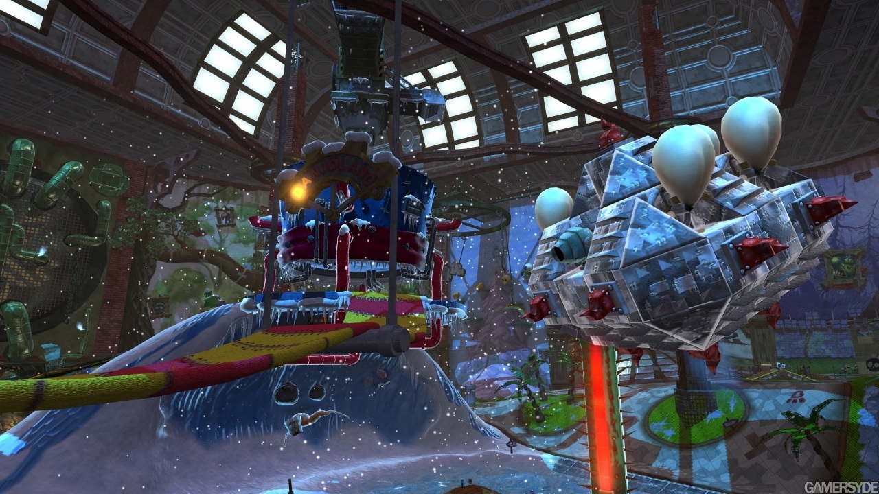
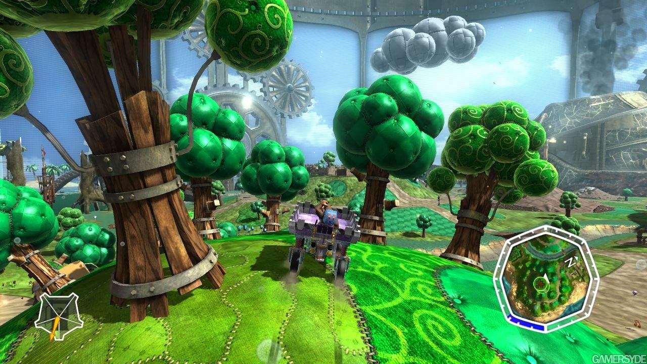
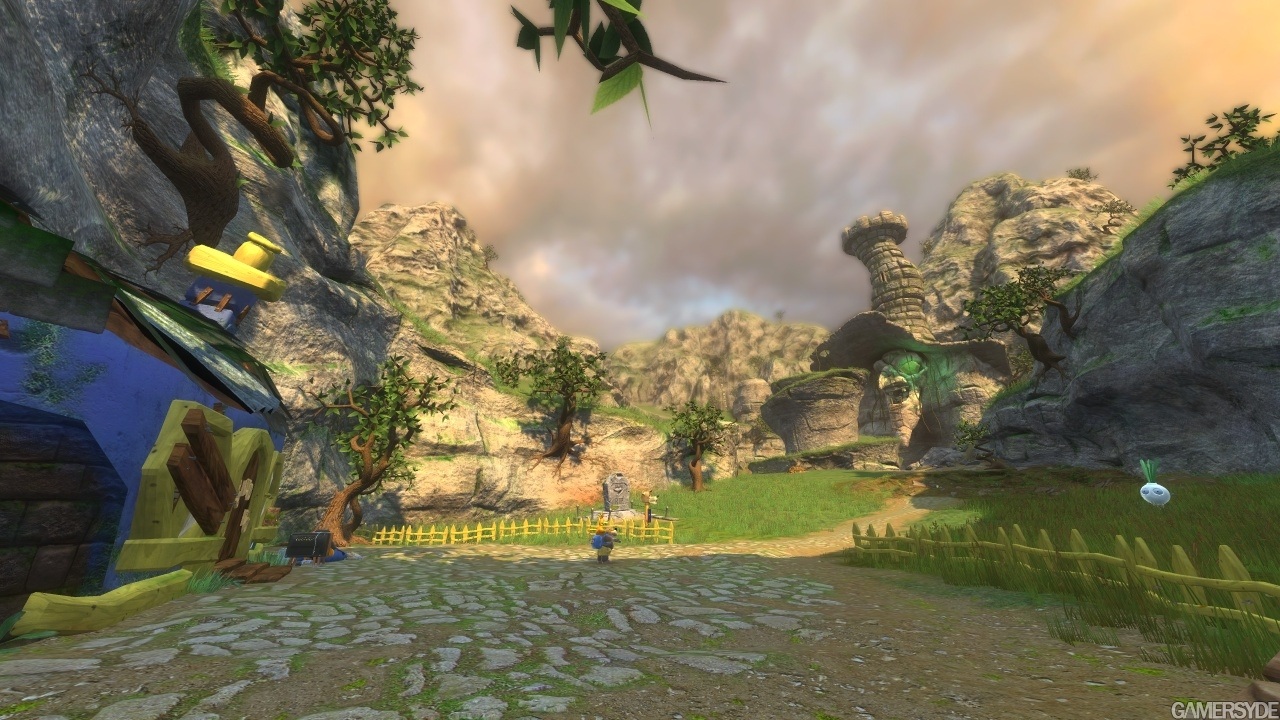
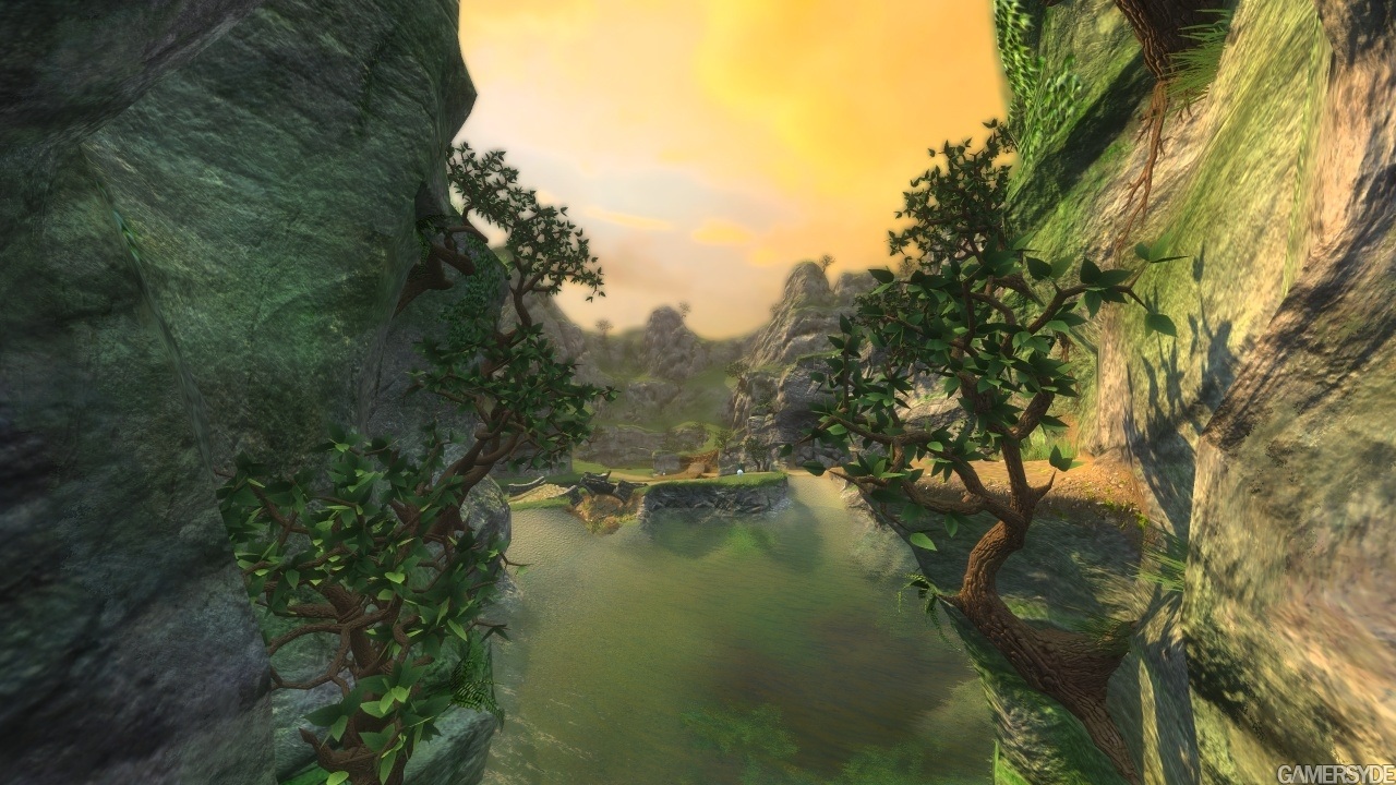
The levels are supposed to look like they've all been stitched together. You even see holes in some of the levels, like the whole thing is a big stage. It's a very original style, and personally I love how it looks.
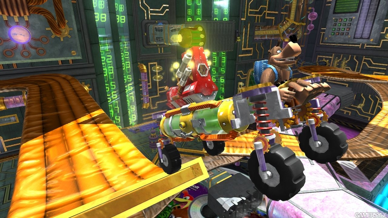
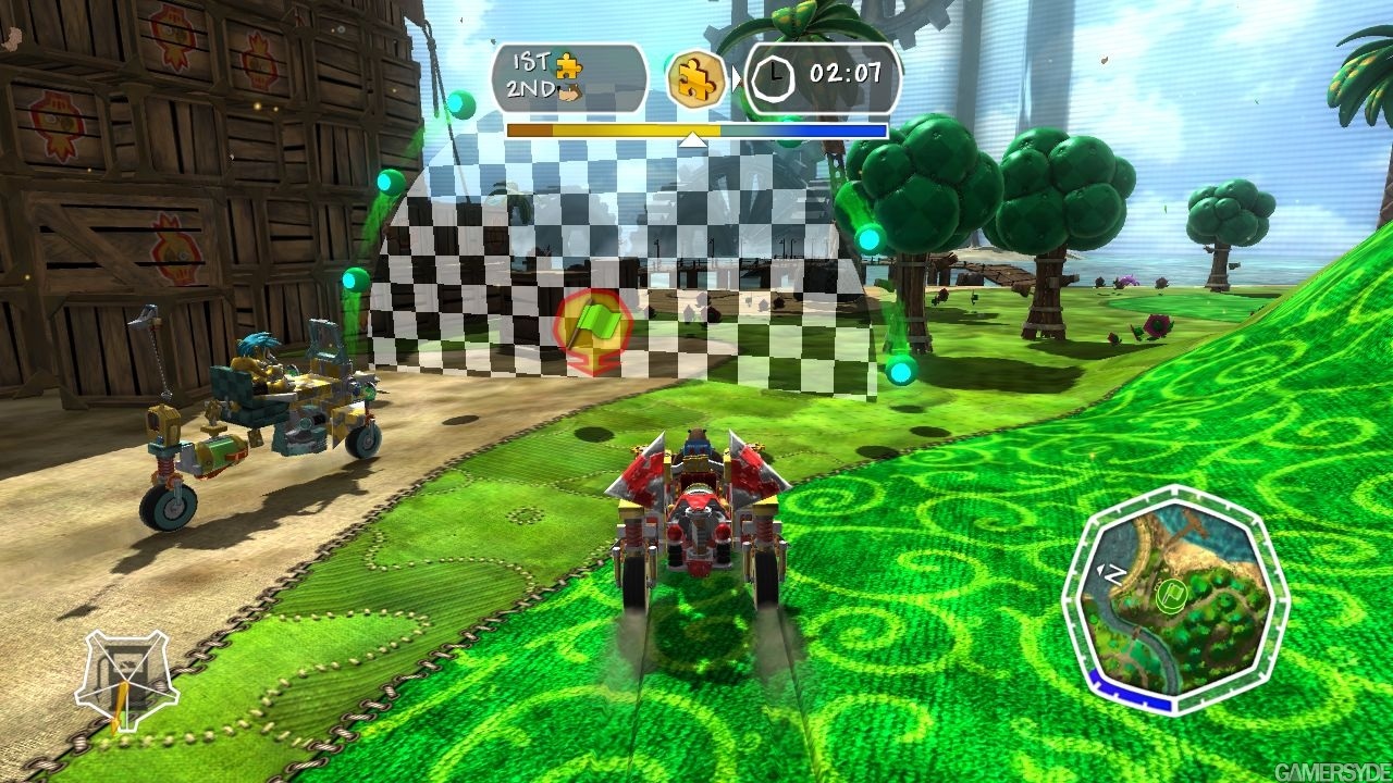
I'm not sure how I feel about them turning Banjo into this vehical game, but it does look like a lot of fun to play still.
A fucking playable pixar movie!! The graphics looks gorgeous, and the last videos (on website gamekyo) are very nice. Smooth movements, very nice animations, HUGE environments and you can do the vehicle you want, use the different parts and your imagination. This game is a Must Have imo.
I *love* the art in some shots, and in others not so much. I think the one with the fake trees and metal clouds is best, gives me almost a Mario-when-it-was-good vibe.
Commented on 2008-09-12 00:56:02 In reply to WinterSnowblind
Posted by WinterSnowblind
The levels are supposed to look like they've all been stitched together. You even see holes in some of the levels, like the whole thing is a big stage. It's a very original style, and personally I love how it looks.
I'm not sure how I feel about them turning Banjo into this vehical game, but it does look like a lot of fun to play still.
i didnt mean that. i ment in the fact its just a jarring mess. take the last screenshot, looks like its from fable or something, yet you have the 6th shot which looks like its out of a cartoon. it just lacks consistancy. as megido said. i dont expect it to be realistic, or look like other games, but a bit of consistancy would be nice. it just looks a mess to me.
take other platformers for example. ratchet and clank, mario, jak etc. they all have a large variety of different worlds and envionments (albiet cliche ones), yet they all feel like they belong in the same game. this however does not. its just random styles thrown in for the sake of it, or at least thats what it looks like.
and i agree about the vehicles, besides the confused 'style' they've gone for its the only other issue i have with the game.
it doesnt look like anything more then a rental at this stage tho imo.
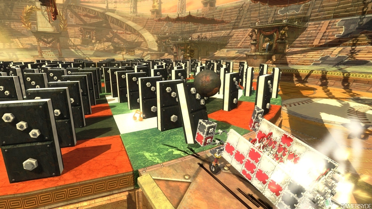
the only true graphical advantages it has over all other games of this style is the shadows imo i was really impresed by the domino pics shading
does anyone think it might get a r rating for nudity
(banjos a girl without a shirt on lol)also ive built better vehicles with legos and the mini map is gunna be annoying but it is tempting to play to see if it could take me back to my child hood days
Oh I have... I won't derail by going into them, but they're not good.
wow your the first person ive encountered who doesnt like Super Mario Galaxy
but please at least send me a message telling me why it wasnt good im intrested in knowing what major flaws you find in it to make it bad
Commented on 2008-09-12 03:20:03 In reply to KORNdog
Posted by KORNdog
i didnt mean that. i ment in the fact its just a jarring mess. take the last screenshot, looks like its from fable or something, yet you have the 6th shot which looks like its out of a cartoon. it just lacks consistancy. as megido said. i dont expect it to be realistic, or look like other games, but a bit of consistancy would be nice. it just looks a mess to me.
take other platformers for example. ratchet and clank, mario, jak etc. they all have a large variety of different worlds and envionments (albiet cliche ones), yet they all feel like they belong in the same game. this however does not. its just random styles thrown in for the sake of it, or at least thats what it looks like.
and i agree about the vehicles, besides the confused 'style' they've gone for its the only other issue i have with the game.
it doesnt look like anything more then a rental at this stage tho imo.
Coming from a pure PS-fanboy it is light as allways.
No suprise that diffrent themes of world is ok for you in Ratchet or Jak for PS but wrong in a Rare-game for Xbox.
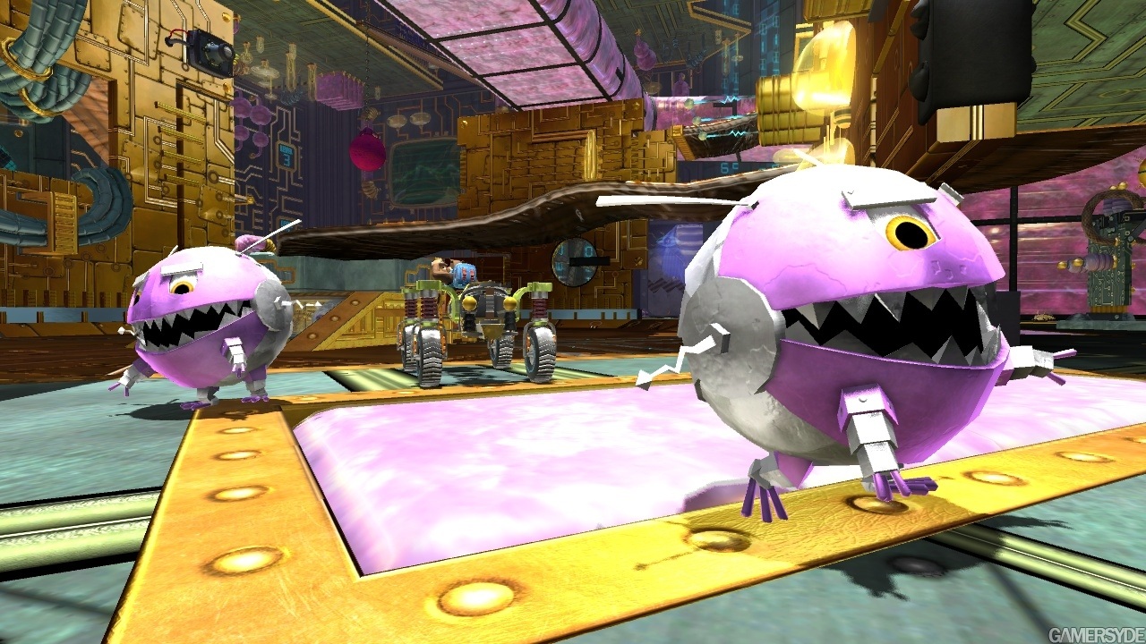
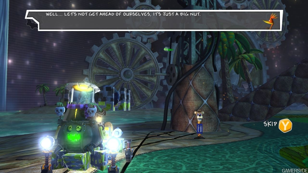
I you look at the pictures all of the last 3 is in the sam world, normal gras and such. The 4 first pictures are from the same robotic thing and the ones between, 3 to the number, is from the ......don't know what to call it.
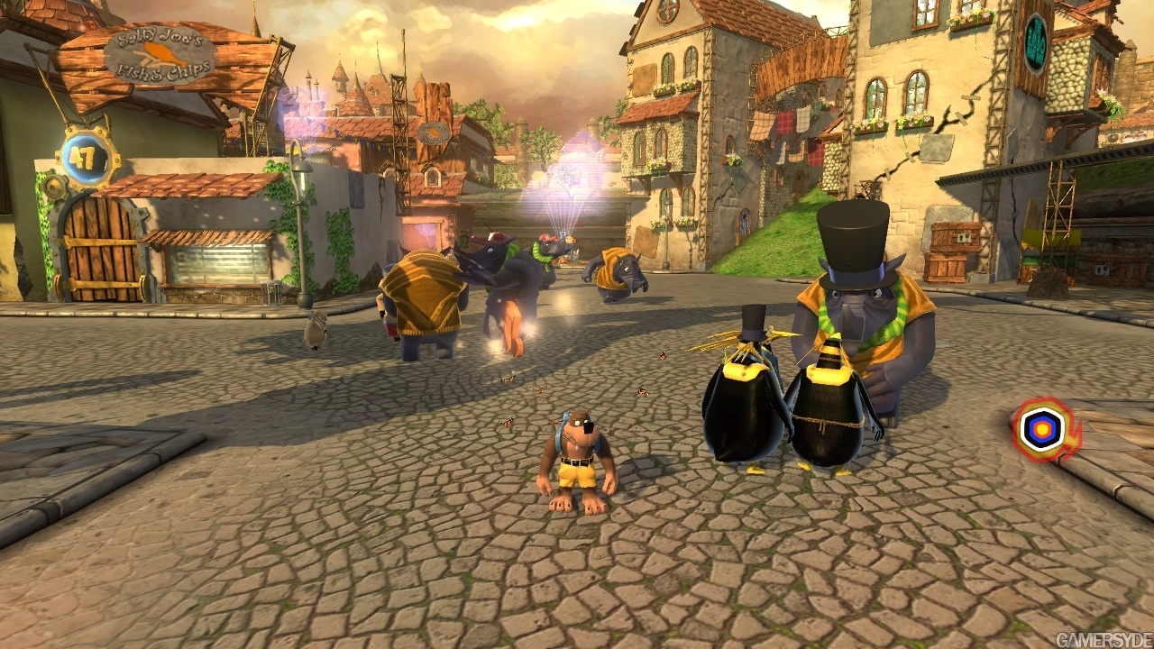
So they are basicly showing of 3 world with these. That is call variation, just like in Mario and Ratchet.........so it is Consistance. The last picture i supose is a zoomed out cutscene from what i belive is the starting world with banjo's home.
If you've played Mario you would have known that most world looks vasty diffrent and have the same amount of consistance as Banjo will. Even in Mario you go from normal houses and gras to world taken from space or something.
This is looking great! I was a huge fan of the original Banjo Kazooie and I was really dissapointed in the sequal, but this looks to be shaping up to be an interesting game. I'll definately be giving this a try.
Commented on 2008-09-12 04:46:26 In reply to PalmiNio
Posted by PalmiNio
Coming from a pure PS-fanboy it is light as allways.
No suprise that diffrent themes of world is ok for you in Ratchet or Jak for PS but wrong in a Rare-game for Xbox.
I you look at the pictures all of the last 3 is in the sam world, normal gras and such. The 4 first pictures are from the same robotic thing and the ones between, 3 to the number, is from the ......don't know what to call it.
So they are basicly showing of 3 world with these. That is call variation, just like in Mario and Ratchet.........so it is Consistance. The last picture i supose is a zoomed out cutscene from what i belive is the starting world with banjo's home.
If you've played Mario you would have known that most world looks vasty diffrent and have the same amount of consistance as Banjo will. Even in Mario you go from normal houses and gras to world taken from space or something.
no, stylistically its not consistant tho is it. you only have to look at it to understand that. and the platform this game is on has no relevance in the matter (what other examples could i have given, its not like platformers are a thriving genre on any console atm, but ratchet and mario are the more recent). i just dont like the look of this game...as shocking as this may seem to you, 360 owners dont have to masturbate over every exclusive on that system. i mean, shock horror, i own a 360 and dont love halo *gasp* i must be a fanboy....lol, idiot.
so, i dont like this, it just doesnt appeal. its art style is all over the shop. and much like kameo, and perfect dark zero, it just goes to prove RARE truely have lost their ability to make good games. viva pinata is the only game that has stood out above the rest this gen and even that has its flaws.
but thats just my opinion. im not alone as megido feels the same. the game just looks like an inconsistant mess. but by all means, you enjoy it.
Loakum
Ugh….scratch that previous comment. The upcoming Game of Thrones video game is a F’in mobile phone game. Why can’t they came an open world GoT game, like Witcher 3 or God of War? (> 3 Months ago)
Loakum
By FAR, the upcoming Game of Thrones King’s Road was the Game of the Show! It plays like God of War Ragnarok! :) (> 3 Months ago)
Loakum
@Driftwood Awesome! I’m loving it! It does show a much crisper picture and the frame rate looks good! I was playing Stella Blade and Dragonball Soarkling Blast! :) (> 3 Months ago)
Driftwood
@Loakum: enjoy, the one Sony sent us will be there on launch day. Coverage will follow asap. (> 3 Months ago)
Loakum
*takes a large sip of victorious grape juice* ok….my PS5 pro arrived early! So much winning! :) (> 3 Months ago)
Driftwood
@reneyvane: non ils l'ont publié le 1er octobre et je crois que tu l'avais déjà linkée. ;) (> 3 Months ago)
reneyvane
Factornews à joué à KingdomComeDeliverance2 au Gamescom 2024 mais ne publie sa preview que maintenant ? [url] (> 3 Months ago)
Driftwood
Download is now functional again on Gamersyde. Sorry for the past 53 days or so when it wasn't. (> 3 Months ago)
Driftwood
Another (French) livestream today at 2:30 CEST but you're welcome to drop by and speak English. I will gladly answer in English when I get a chance to catch a breath. :) (> 3 Months ago)
Driftwood
GSY is getting some nice content at 3 pm CEST with our July podcast and some videos of the Deus Ex Mankind Divided preview build. :) (> 3 Months ago)
Driftwood
For once we'll be live at 4:30 pm CEST. Blim should not even be tired! (> 3 Months ago)
Driftwood
More Quantum Break coverage coming in a few hours, 9:00 a.m CEST. (> 3 Months ago)
Driftwood
We'll have a full review up for Firewatch at 7 pm CET. Videos will only be tomorrow though. (> 3 Months ago)
Driftwood
Tonight's livestream will be at 9:15 GMT+1, not GMT+2 as first stated. (> 3 Months ago)


 Patreon


All comments (56)
Commented on 2008-09-11 22:55:19
Commented on 2008-09-11 23:01:47
Commented on 2008-09-11 23:09:33so now its GoW2 NHL09 and this, (fable will have to wait)
Commented on 2008-09-11 23:12:11
Commented on 2008-09-11 23:25:31 In reply to KORNdog
Commented on 2008-09-11 23:45:38
Commented on 2008-09-11 23:48:12
Commented on 2008-09-11 23:56:13 In reply to Schmooboofables imo will be the best game of the year this game is a definit buy but youll have to convince me anyways it going to be an expensive holiday season and a childs game i played in the second grade wont cut it
my top 10 of the year
10.heavy rain
9.star wars force unleashed
8.gears of war 2
7.dead space
6.far cry 2
5.fallout 3
4.little big planet
3.metal gear solid 4
2.spore
1.fable
Commented on 2008-09-12 00:00:59 In reply to Blue_Eagle44At any rate, i'm not complaining about the fact that the game doesn't look like gears of war, it just doesn't look appealing to me. Sheesh, is it a crime?
I particularly dislike the texture work to be honest. It's great that they have high resolution textures, but to me it seems the textures have too much detail, so much as to almost distract me from what is really important on the screen. It just feels cluttered.
But like i said, i usually think that Rare has terrible design in almost all their games. Viva Piñata probably has the best design, cause only the bipedal characters look like shit in that.
Commented on 2008-09-12 00:14:29 In reply to Blue_Eagle44
Commented on 2008-09-12 00:17:36 In reply to KORNdogI'm not sure how I feel about them turning Banjo into this vehical game, but it does look like a lot of fun to play still.
Commented on 2008-09-12 00:17:54
Commented on 2008-09-12 00:54:15
Commented on 2008-09-12 00:56:02 In reply to WinterSnowblindI'm not sure how I feel about them turning Banjo into this vehical game, but it does look like a lot of fun to play still.
take other platformers for example. ratchet and clank, mario, jak etc. they all have a large variety of different worlds and envionments (albiet cliche ones), yet they all feel like they belong in the same game. this however does not. its just random styles thrown in for the sake of it, or at least thats what it looks like.
and i agree about the vehicles, besides the confused 'style' they've gone for its the only other issue i have with the game.
it doesnt look like anything more then a rental at this stage tho imo.
Commented on 2008-09-12 01:37:47 In reply to Ichi
Commented on 2008-09-12 01:45:11 In reply to pUMBa305
Commented on 2008-09-12 01:46:50does anyone think it might get a r rating for nudity
(banjos a girl without a shirt on lol)also ive built better vehicles with legos and the mini map is gunna be annoying but it is tempting to play to see if it could take me back to my child hood days
Commented on 2008-09-12 01:58:43 In reply to Ichibut please at least send me a message telling me why it wasnt good im intrested in knowing what major flaws you find in it to make it bad
Commented on 2008-09-12 03:12:05
Commented on 2008-09-12 03:15:31
Commented on 2008-09-12 03:16:05 In reply to pUMBa305
Commented on 2008-09-12 03:20:03 In reply to KORNdogtake other platformers for example. ratchet and clank, mario, jak etc. they all have a large variety of different worlds and envionments (albiet cliche ones), yet they all feel like they belong in the same game. this however does not. its just random styles thrown in for the sake of it, or at least thats what it looks like.
and i agree about the vehicles, besides the confused 'style' they've gone for its the only other issue i have with the game.
it doesnt look like anything more then a rental at this stage tho imo.
No suprise that diffrent themes of world is ok for you in Ratchet or Jak for PS but wrong in a Rare-game for Xbox.
I you look at the pictures all of the last 3 is in the sam world, normal gras and such. The 4 first pictures are from the same robotic thing and the ones between, 3 to the number, is from the ......don't know what to call it.
So they are basicly showing of 3 world with these. That is call variation, just like in Mario and Ratchet.........so it is Consistance. The last picture i supose is a zoomed out cutscene from what i belive is the starting world with banjo's home.
If you've played Mario you would have known that most world looks vasty diffrent and have the same amount of consistance as Banjo will. Even in Mario you go from normal houses and gras to world taken from space or something.
Commented on 2008-09-12 03:20:13 In reply to broman
Commented on 2008-09-12 03:35:30
Commented on 2008-09-12 04:46:26 In reply to PalmiNioNo suprise that diffrent themes of world is ok for you in Ratchet or Jak for PS but wrong in a Rare-game for Xbox.
I you look at the pictures all of the last 3 is in the sam world, normal gras and such. The 4 first pictures are from the same robotic thing and the ones between, 3 to the number, is from the ......don't know what to call it.
So they are basicly showing of 3 world with these. That is call variation, just like in Mario and Ratchet.........so it is Consistance. The last picture i supose is a zoomed out cutscene from what i belive is the starting world with banjo's home.
If you've played Mario you would have known that most world looks vasty diffrent and have the same amount of consistance as Banjo will. Even in Mario you go from normal houses and gras to world taken from space or something.
so, i dont like this, it just doesnt appeal. its art style is all over the shop. and much like kameo, and perfect dark zero, it just goes to prove RARE truely have lost their ability to make good games. viva pinata is the only game that has stood out above the rest this gen and even that has its flaws.
but thats just my opinion. im not alone as megido feels the same. the game just looks like an inconsistant mess. but by all means, you enjoy it.